In the most simplistic terms, colour appears to the human eye (1) where there is light and (2) what part and how much of the light waves are absorbed or reflected off of an object. Taking this into account, why is an apple red? In this example, sunlight (the full rainbow spectrum) hits the apple and while all other colour waves are absorbed, only the red lightwaves bounce off the fruit and meet the eye, and we see the apple as “red”.
More than just a tangy tasty fruit, red is the colour of danger, ladybugs, and Valentine’s Day. Or maybe it means something different to you?
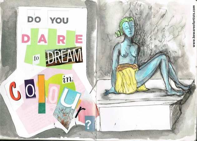
Still confused about what you’re doing here? Read this…
Your TURN to DRAW!
For all its simplicity, colour and our history with hue is many thousands of years old, and the millions of colours that can be seen by the human eye take on as wide variety of meanings and functions, all utterly depended on context and even who is looking at it. So, today’s ransom note is daring you to explore colour and its personal significance to you.
- Using your favourite colour medium, put down a few colour swatches. If you’ve got enough paper, tear them into smallish pieces of paper (or get small index cards, say, 3×5 inches) and put a colour on each separate piece. Consider each swatch carefully, and then on the back of the swatch, note down adjectives or other descriptive phrases that express what each colour means to you. Is it a colour of sadness? Of joy? Nostalgia? Does this colour remind you of a moment of your past? Alternately, on another set of small cards/pieces of paper, write adjectives or phrases to describe emotions or moods, and then on the other side, put down colour swatches or mixes to express a series of emotions, one on each paper. Keep these for future reference – your feeling about them might change with time. Keep it abstract!

- What is your favourite colour and why? Make a drawing, collage, painting or other work centred around a colour that is especially meaningful to YOU.

I love bright warm colours and this quick study makes me think of bright summer afternoons. Or even early autumn when the weather is still warm and the trees are all dressed in radiant reds and golds. - For another look at colour, you can make colour wheels to discover colour relationships. To start, print or copy the colour wheel template below, then starting with the primary colours (yellow, blue, red) try to make your own colour wheel by mixing first the primary colours, to make secondary colours (green, orange, and purple), then mixing again the colours in between the secondaries to make tertiary colours (yellow-green, yellow-orange, orange-red, magenta, violet, and blue-green). Go back to this simple exercise as often as needed to perfect your “colour eye” – and always have a go especially to familiarise yourself with new materials and help you get your palette up to speed!
 Here is a colour template from artist, teacher, and author Betty Edwards, which you can copy and then practice making your own colour wheels.
 Example colour wheels based on Betty Edwards’ template, using ink and watercolour. (clockwise from top left: Winsor & Newon ink, Cotner pan watercolour, Koh-i-noor pan watercolour, Artisan oils)
 An example colour wheel from Johanes Itten’s ‘Elements of Colour’
Maybe this Ransom Note gives you a different idea? Let me know!
SHARE the LOVE
![]()
You’ve come this far, now why not
<<<<< click to share your creativity – @beware.of.artists
Not only does your creativity need YOU, but here’s a surprise, the world needs your creativity, too! By sharing your response to a Ransom Note, we are building a community who will enjoy, be inspired by, and learn from each other. Who knows, maybe some of us will “find our tribe” or even make the world that tiny bit more pleasant to be in than it was 15 minutes ago!
How other artists DREAM IN COLOUR
- Courtney Quinn is an American style influencer who lives, breathes, and eats everything in bright living COLOUR. You can check her out on social media under Colour Me Courtney
Courtney Quinn in Amsterdam. Image courtesy http://www.colormecourtney.com - Award-winning American painter Amy Sherald, perhaps best known for her realist portraits, chooses subjects that “look to enlarge the genre of American art historical realism by telling African-American stories within their own tradition.” She was commissioned to make the official portrait of First Lady Michelle Obama in 2018, wearing a couture gown by Michelle Smith “…with a modern geometric pattern that the Sherald said reminded her of the works of 20th century Dutch painter Mondrian and the African-American quilting tradition of Gee’s Bend, Alabama.“
 Image courtesy http://www.amysherald.com
 Michelle Obama, 2018. Image courtesy the artist.
 - British artist Hannah Campion is a multidisciplinary artist whose work is immediately recognisable in any medium by the copius use of seemingly impossible hues that manage to be dreamy and vibrant all at once. Trust me, being immersed in one of her installations is a magical experience.
 Paintings by Hannah Campion. Image courtesy http://www.hannahcampion.com
 Hannah Campion, ‘Rainbow Room’, 2018. Image courtesy http://www.hannahcampion.com. Photo credit: Kev Howard.
BONUS: Here are but a few more interesting resources about COLOUR
 Betty Edwards (famous for her “Drawing on the Right Side of the Brain” book that got millions of people drawing when they didn’t think they ever could) followed up that iconic art manual with “Colour – A Course in Mastering the Art of Mixing Colours“. In it she includes templates and easy-to-follow exercises to help you understand why as well as how to mix colours that you see, in your mind or in your imagination. Highly recommended!
 Another seminal book on colour theory is from 1960s Bauhaus, with Johannes Itten’s “Elements of Colour” . A bit drier than Edwards’ book but well worth a look for exercises, templates, and a slightly different approach to colour theory in art.
Canva.com has a number of great articles about colour history, colour theory, and some case studies about how colour is used, e.g., in branding/marketing.

And there are MANY more!
What other artists or techniques can you think of? Let me know!
